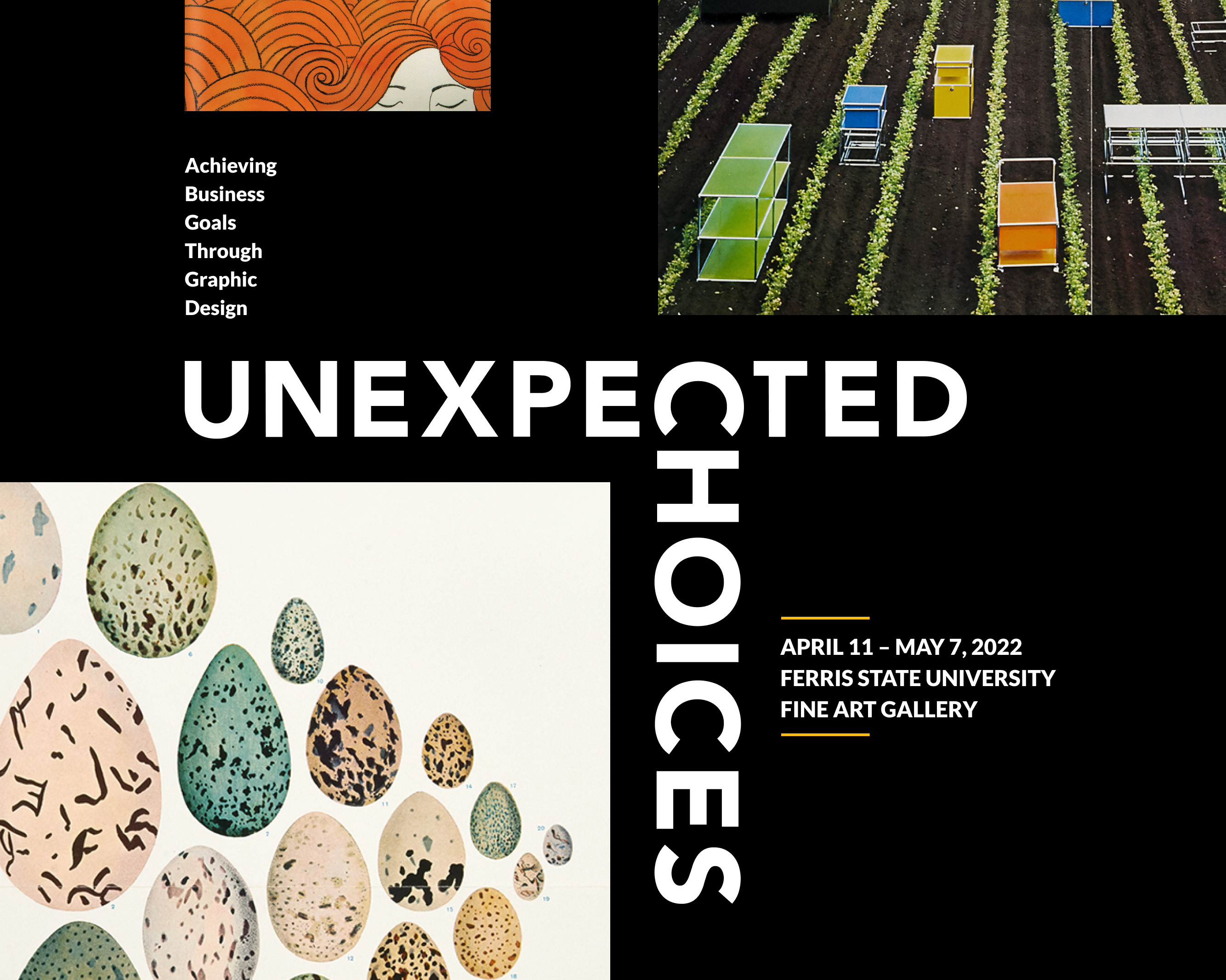
BUILDING A LEGACY
Revising the project submission process and optimizing the digital experience for the West Michigan Graphic Design Archives.
Objectives
Reduce the amount of manual data entry in their project submission process
Create a form for them to collect details on accepted submissions
Visual consistency across the site
UX/UI considerations for mobile and tablet screen sizes
Create a form for them to collect details on accepted submissions
Visual consistency across the site
UX/UI considerations for mobile and tablet screen sizes
MY ROLE
In this project, I was responsible for conducting user research, collecting secondary UX/UI insights, diagramming process flows, organizing a design system, and creating static prototypes
Tools used
Figma, Illustrator, InDesign, Photoshop, Miro, Slack
DURaTION
6 Weeks
Deliverables
Research Document, Brand Manual
DEFINING CONTENT
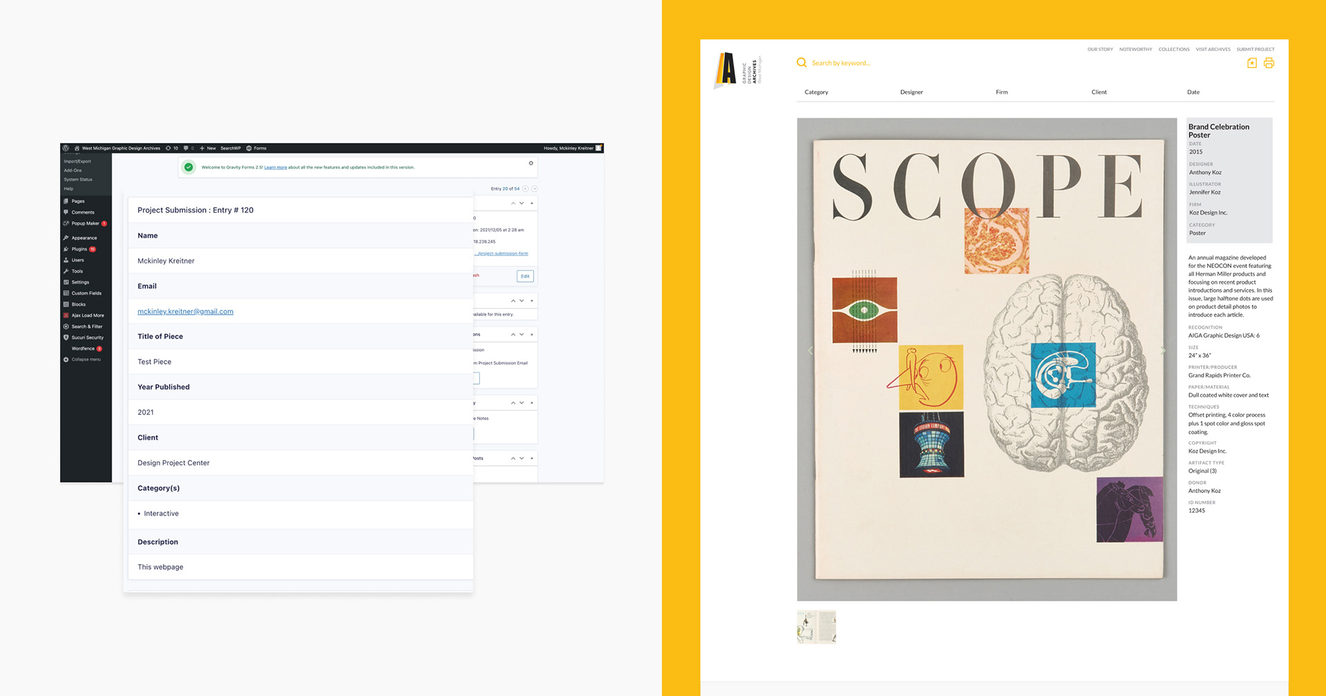
Our team audited the current project submission process and identified opportunities to reduce manual data and improve our client’s workflow.
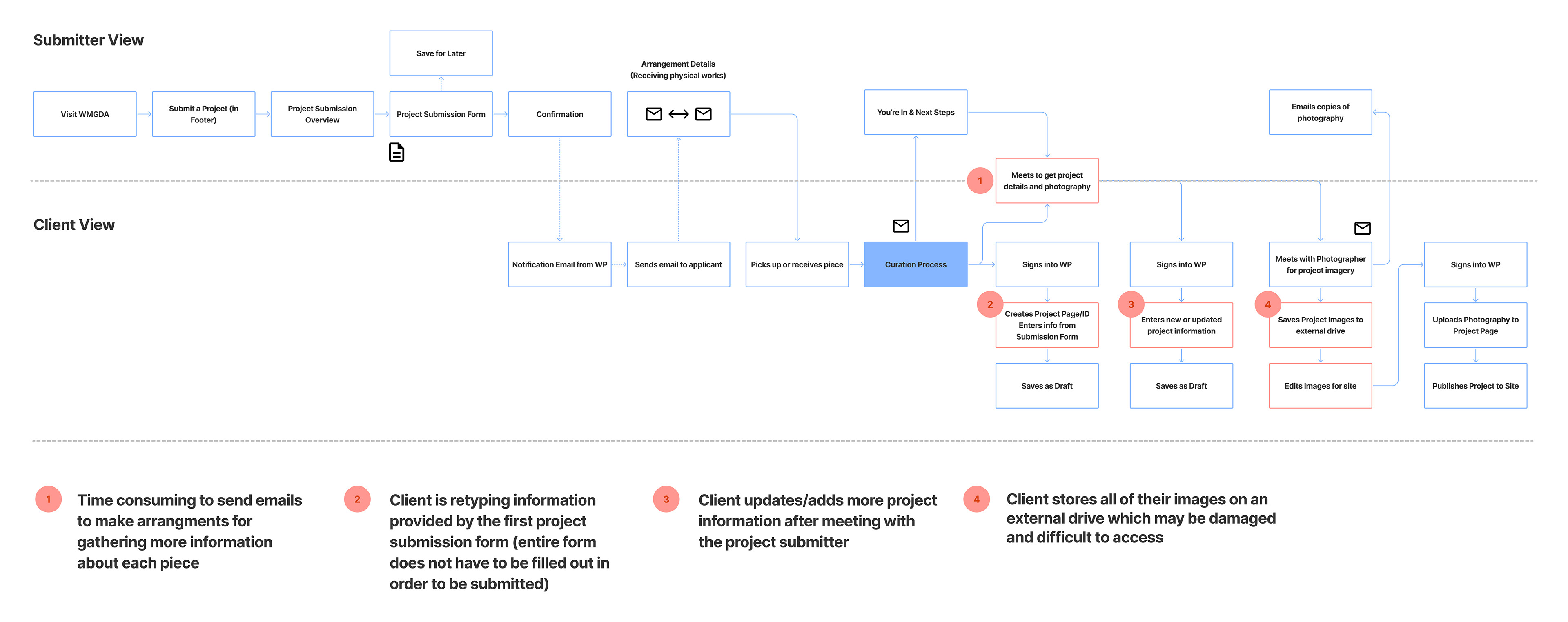
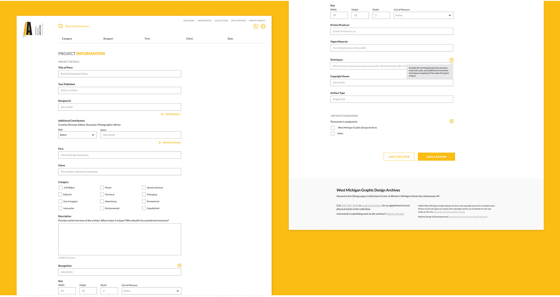
To minimize time spent on manually retyping information, we proposed a second form called project information filled out by a submitter once accepted into the archives. The data submitted in this form will be reviewed/edited by stakeholders and automatically populate a project page.
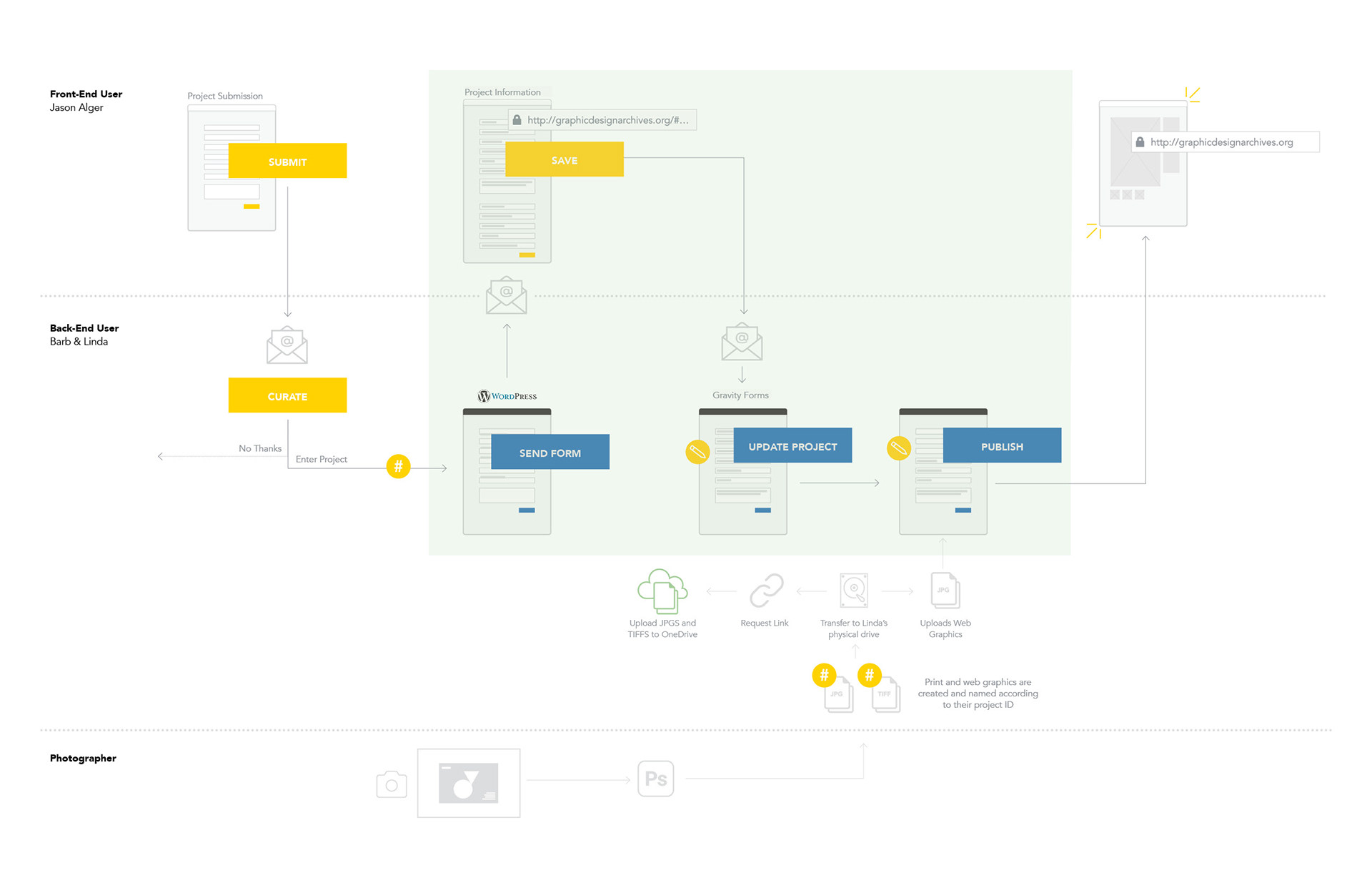
We also recommended that our clients upload their project imagery into a cloud-based storage system for additional security.
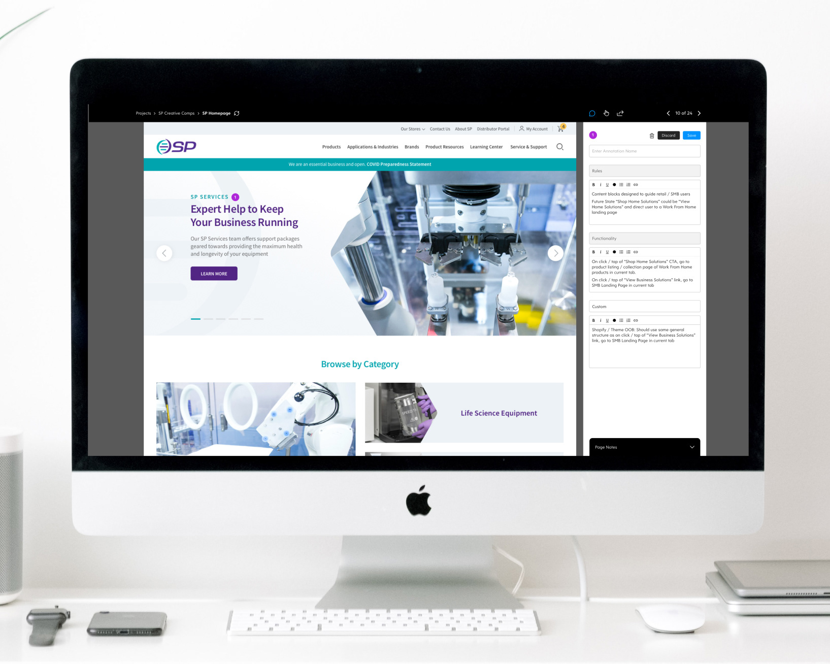
revising usability of the project submission form
Once we established a plan, I worked on revising the UI of the current project submission form to aid usability for project submitters.
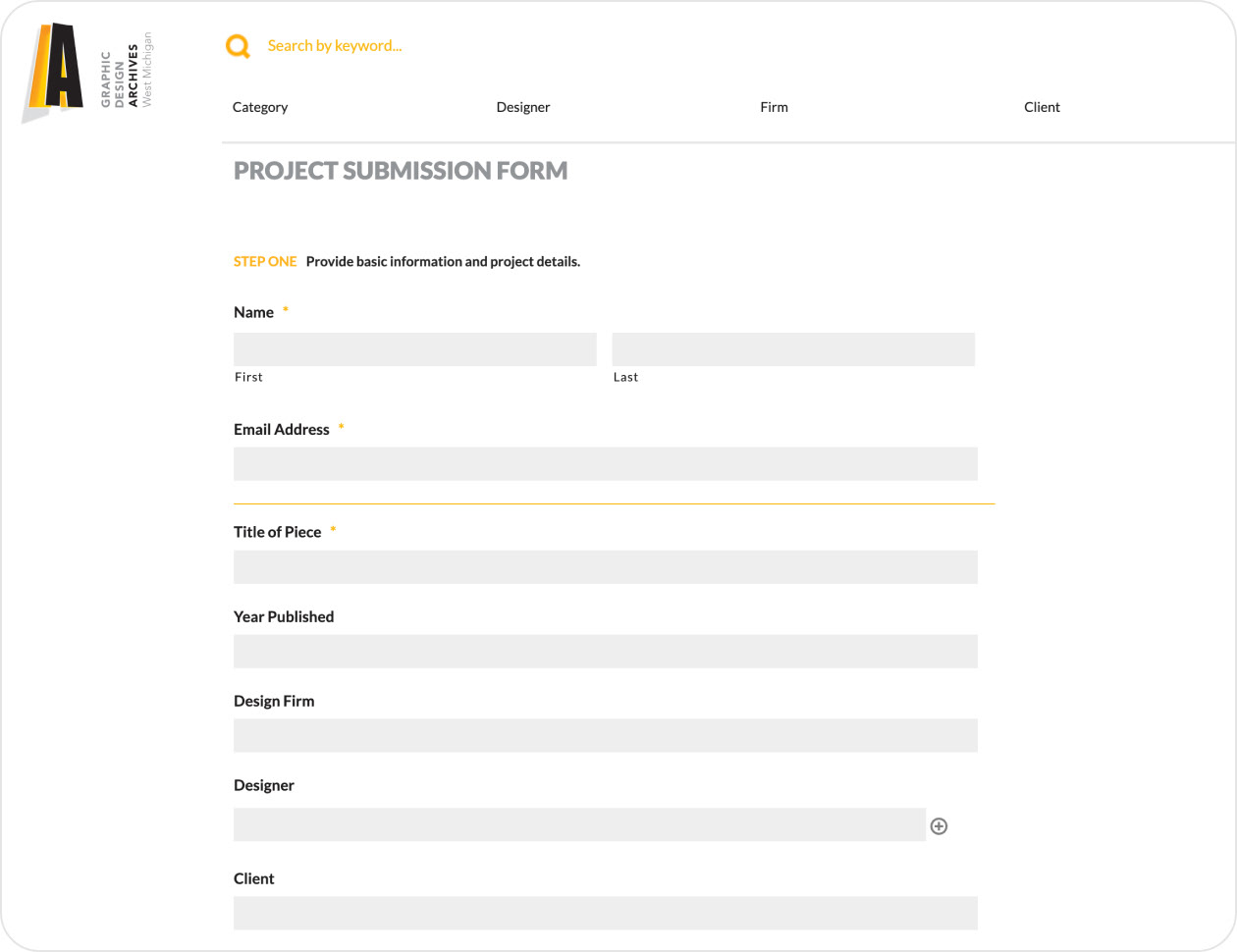
After researching form UX/UI best practices, I identified UI issues impacting usability. The current UI of the form fields looks disabled and does not provide placeholder text to assist users in understanding what content should be placed in each field.
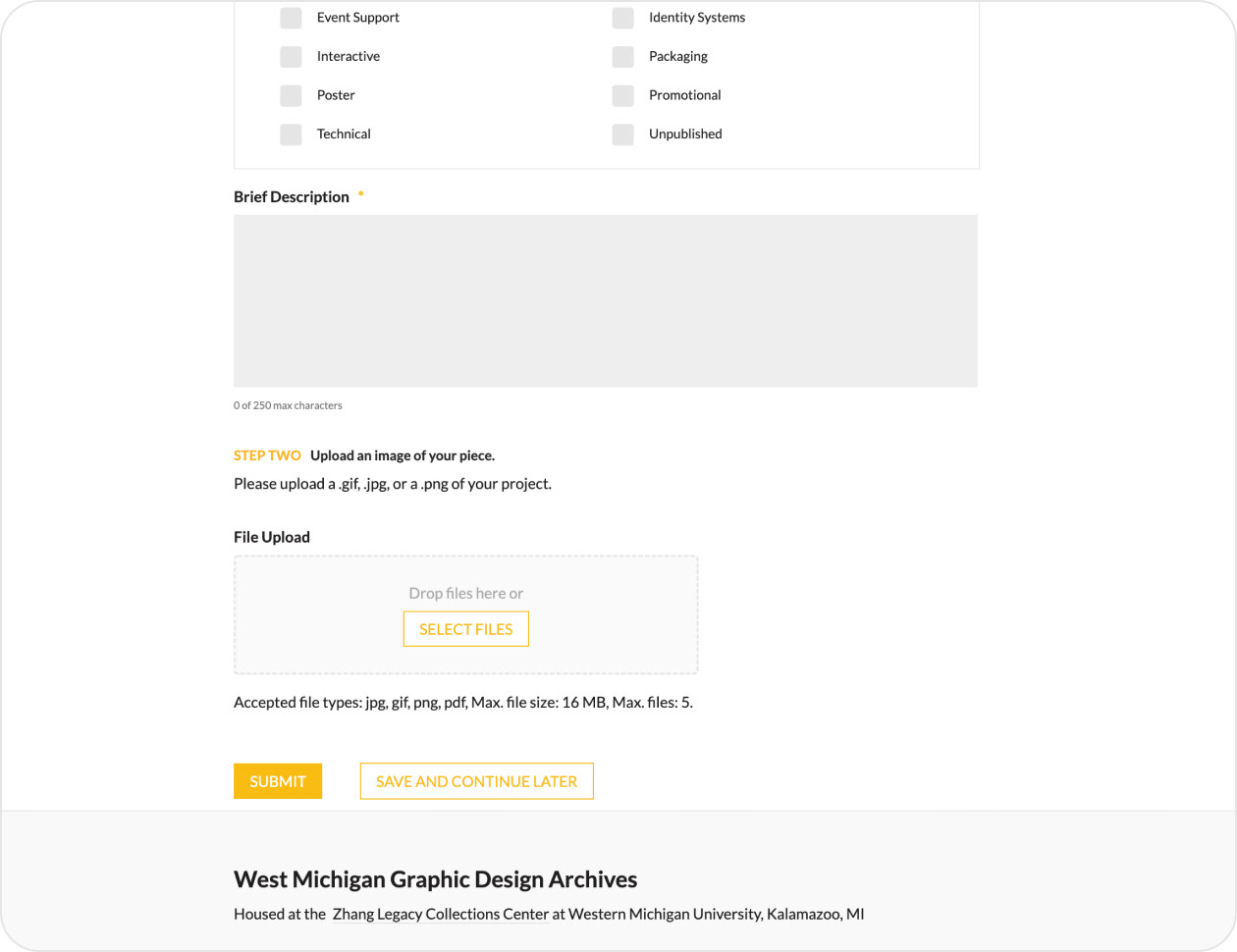
We also noticed issues in the hierarchical relationship between different steps. Lastly, there was no validation or feedback to provide users with confidence that the information they entered was correct.
To resolve the UI issues we noted, we readjusted the type strategy to help the hierarchical relationships and created placeholder text and validation to help users fill out the form.
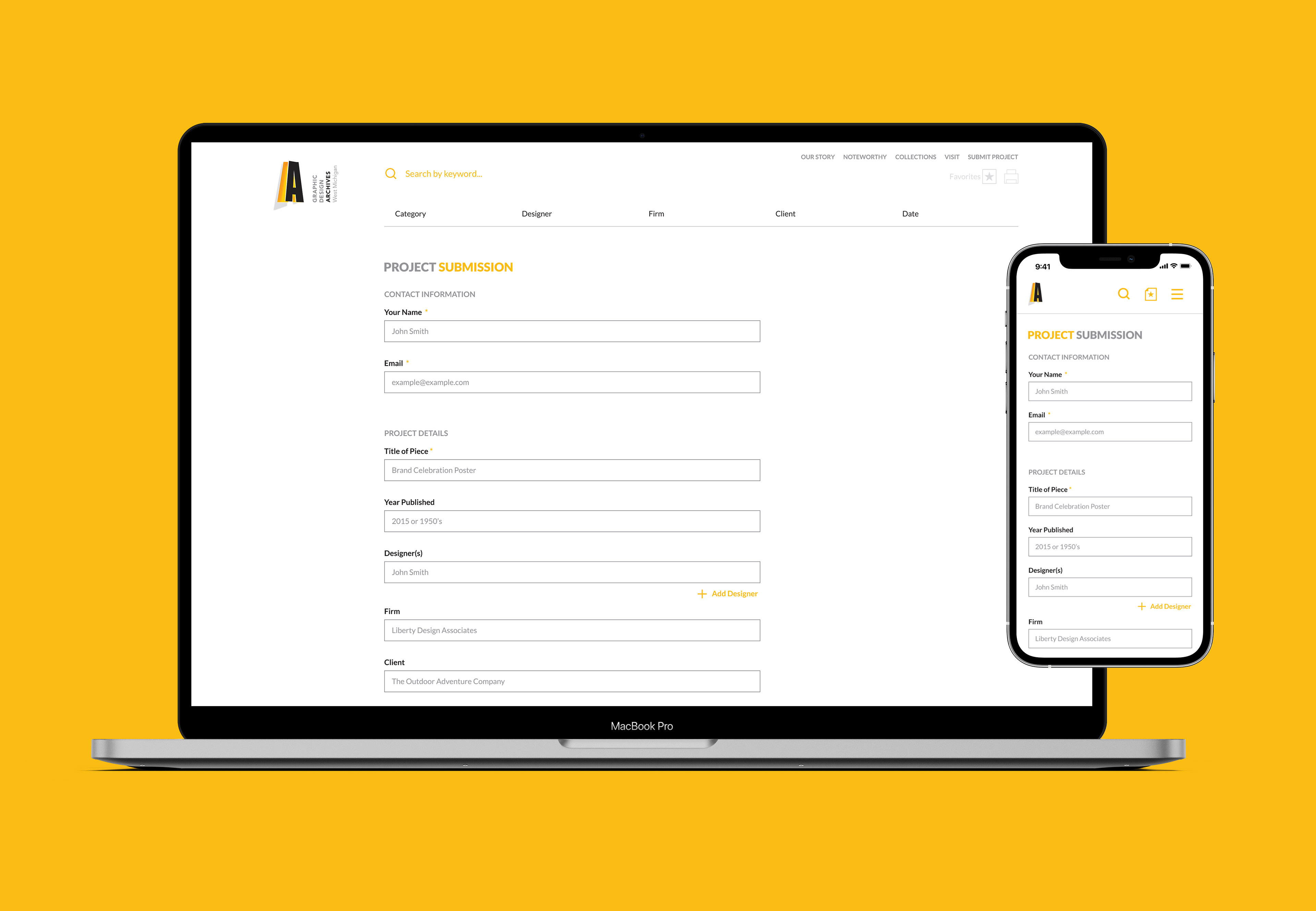
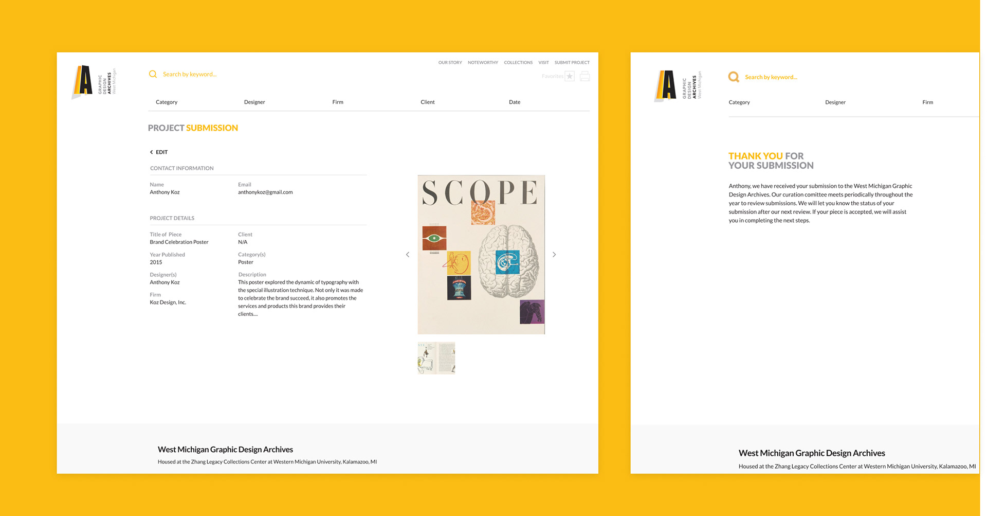
We also added a review page where a user can quickly scan the information they are submitting. Lastly, we presented the user with a confirmation message clarifying their next steps.
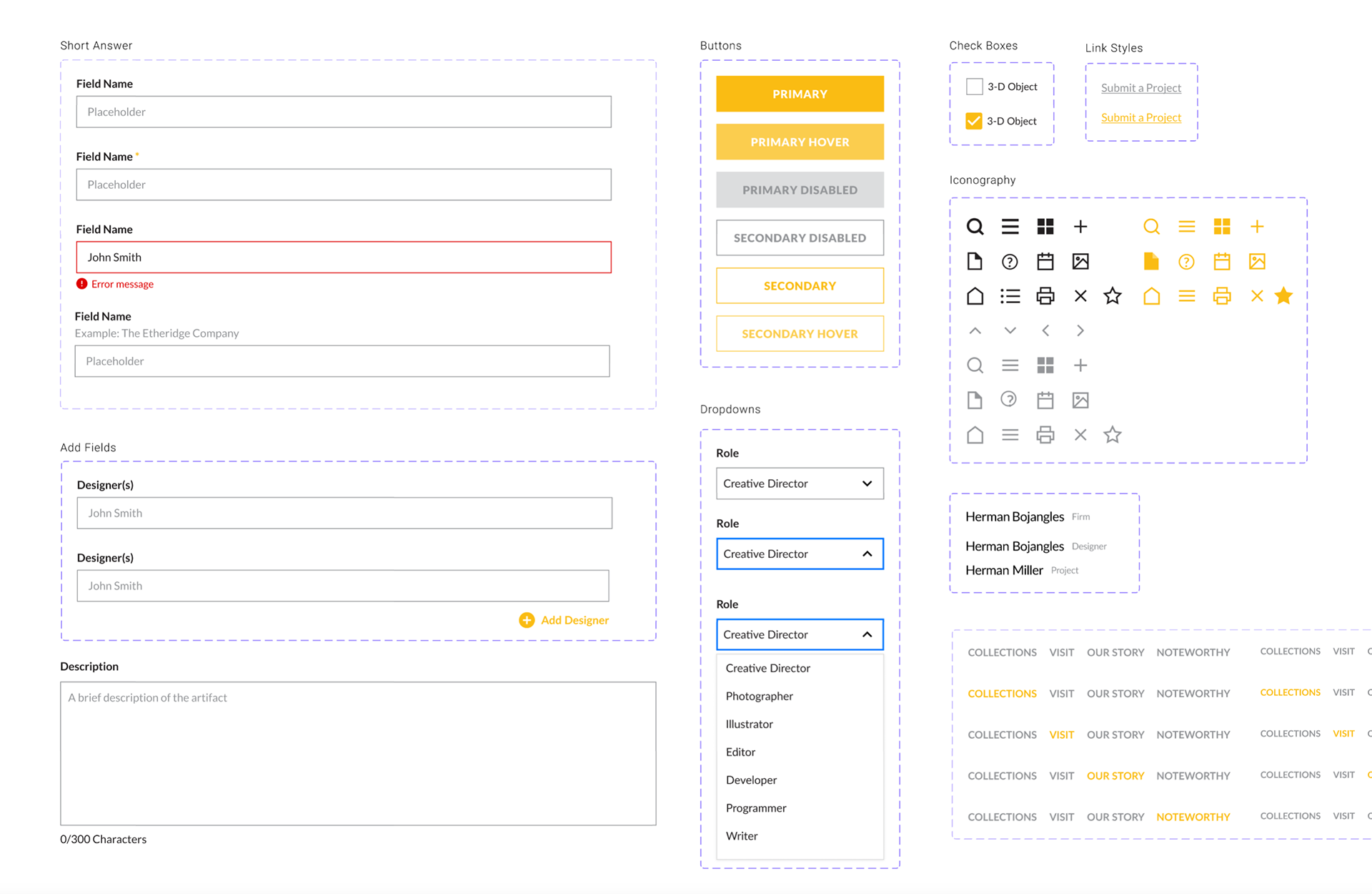
As our team began prototyping new pages and forms, I noticed a need for a pattern library to make our workflow more efficient. Our team gathered together to audit components on the existing site and quickly built components.
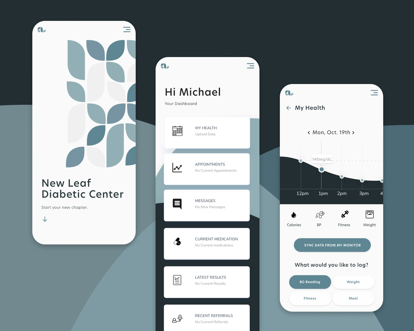
Utilizing Submitter Data
Once a piece is selected to be a part of the archives, our client sends an email with a link to the project information form from their WordPress account.
Once the project submitter submits this form, our client is notified via email and prompted to review the entered information. They can revise any information they need and then publish it to the live site.
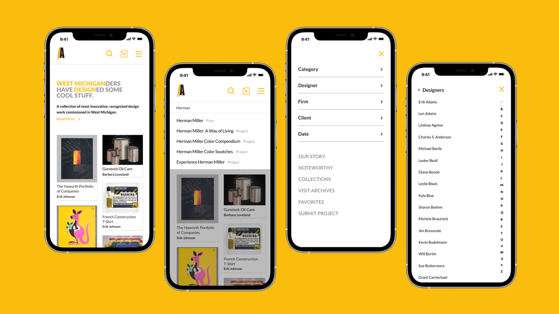
Improving the mobile experience
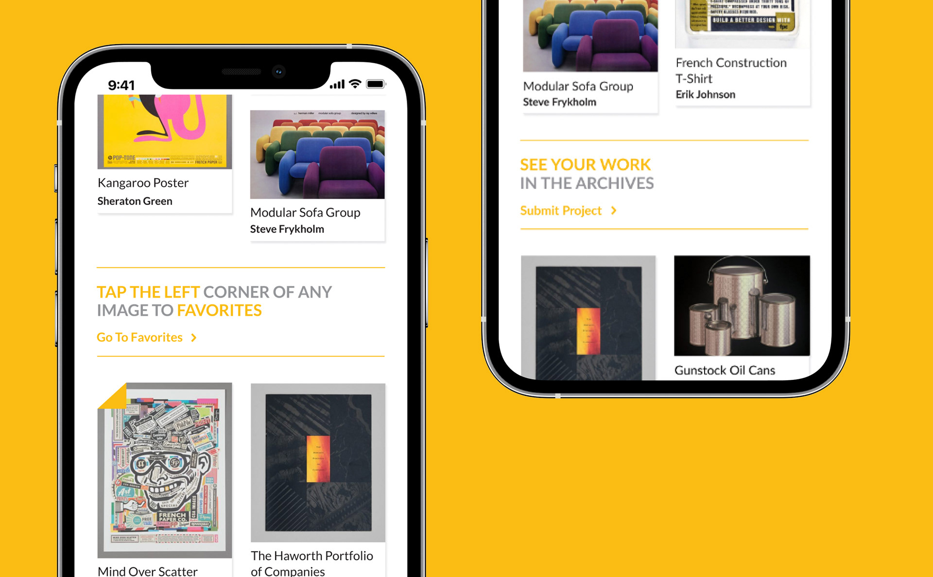
To optimize the mobile experience, we interviewed design educators and design professionals and we learned that they primarily use this site for quickly referencing examples. This placed importance on resolving usability issues with browsing and navigating the site.
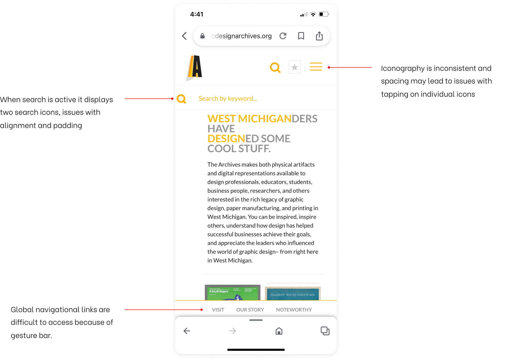
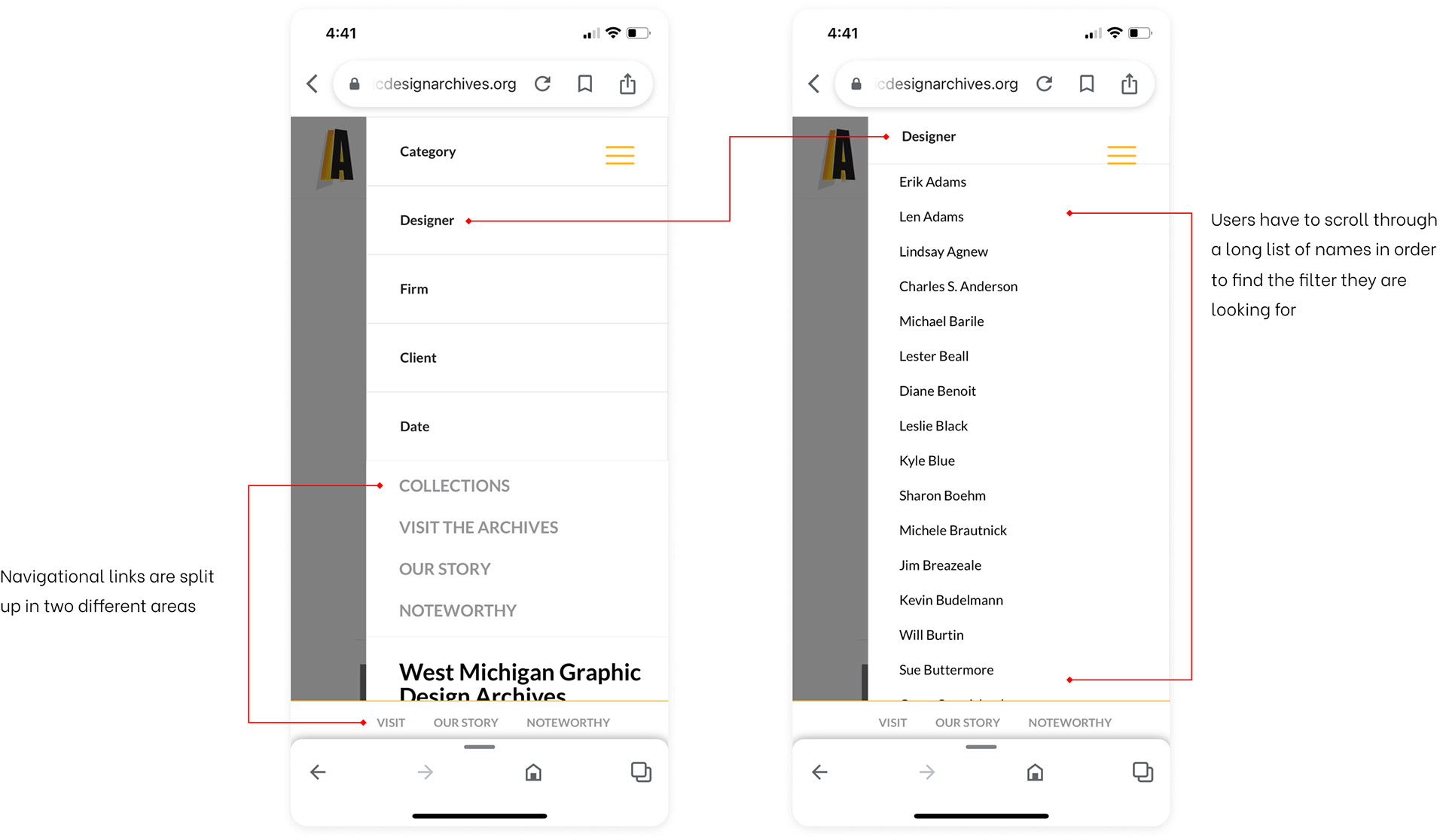
To resolve navigational issues, we created a more consistent iconography style, a federated search that shows different categories of results, established a clear hierarchy between filters and global navigation, and incorporated a way to manage long lists of filter options.
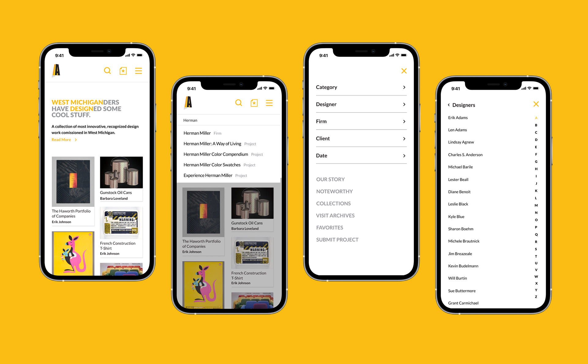
Many users were unaware of their ability to favorite pieces for quick reference, schedule a visit to the archives, and submit work. To accommodate for this, we integrated call-to-action cards in between project cards to inform users as they browse the homepage.