FERRIS DESIGN SYSTEM
Designing the UI and documentation of digital assets for Ferris State University (FSU) Design Program’s design system.
Objective
Develop a tool that enables faculty and students of the FSU Design Program to design consistent communications inline with the program’s brand.
Challenge
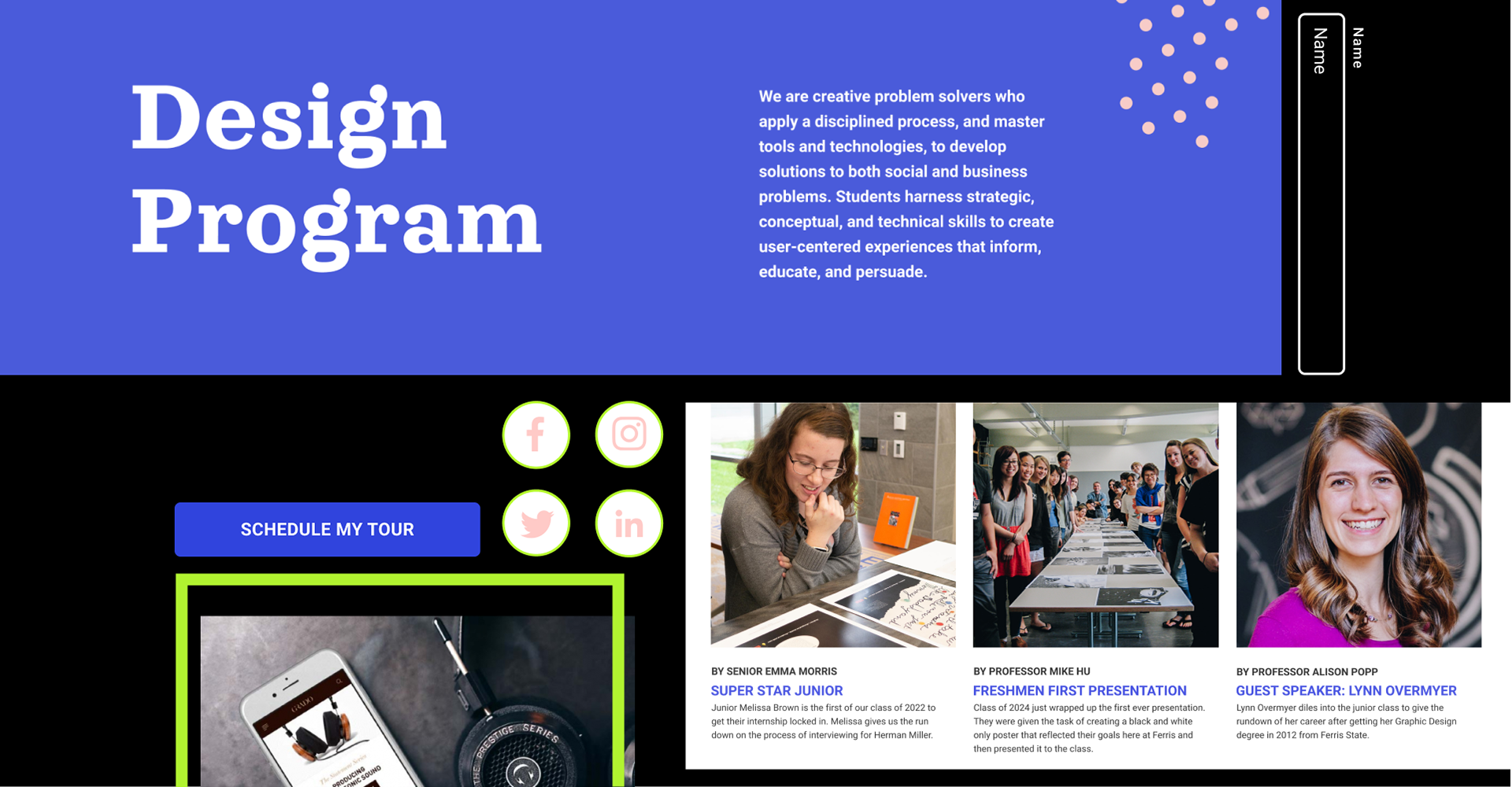
Each year inconsistencies in the design program brand occur as faculty members work with different student groups to develop marketing communications. Identifying this opportunity, our team of 12 proposed a digital library that centralizes documentation of the brand and accessibility to design and development tools.
MY ROLE
In this project, I led the charge for understanding the strategy, design, and development of our design system.
MY ROLE
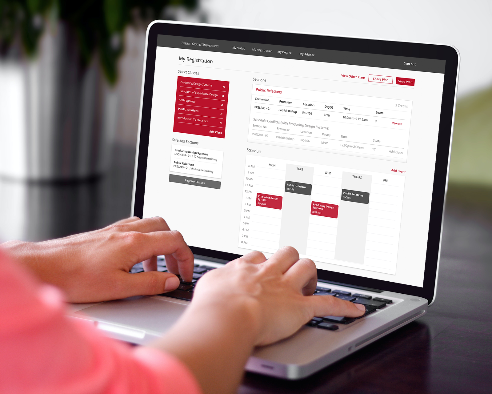
Figma Pattern Library
Design System Website
Documentation of Design Tokens & Components
Design System Website
Documentation of Design Tokens & Components
Defining CONTENT
I started by auditing the assets of the design program. This helped me discover the range of content that will need to be accounted for in our system.
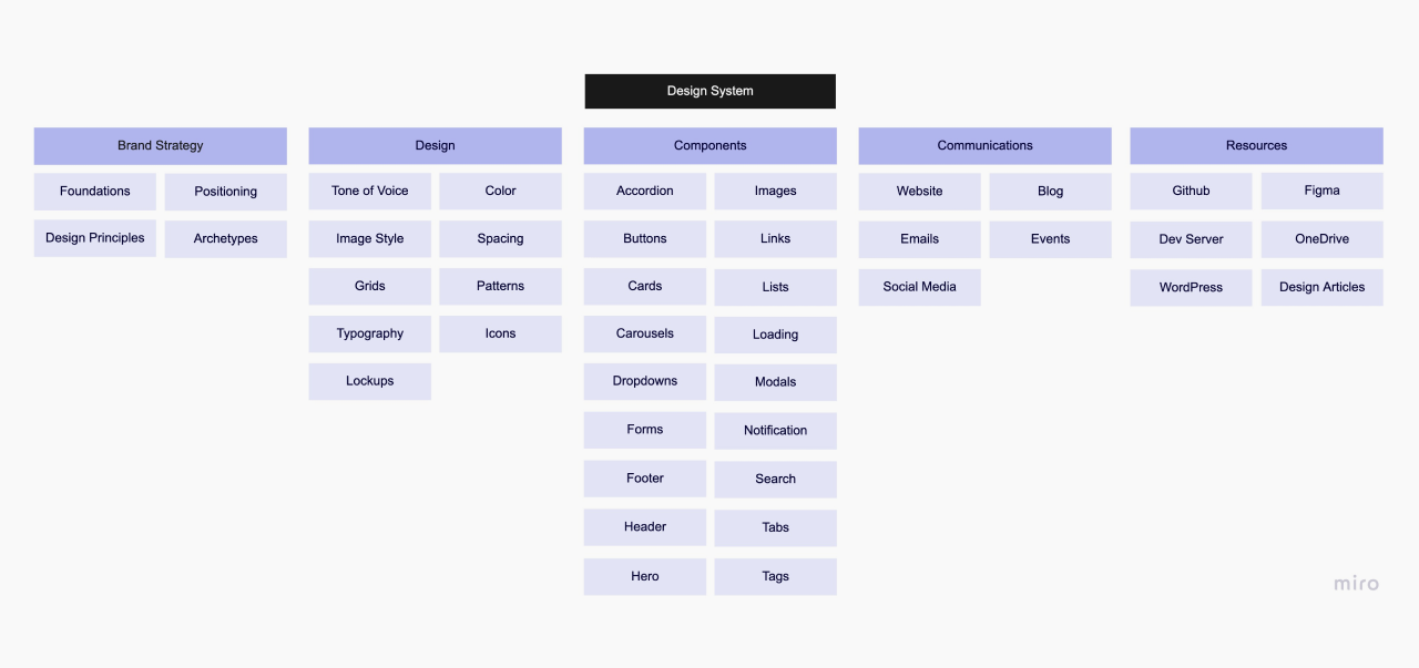
Auditing Design Systems
Evaluating design systems provided insight on information architecture, documentation, and features that aid content accessibility.
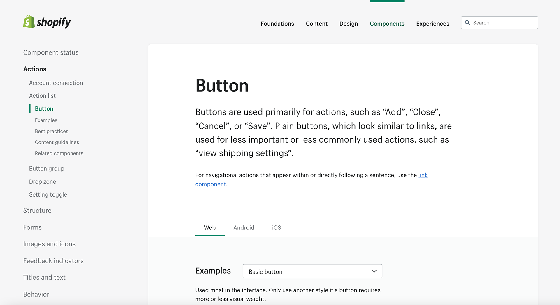
Polaris Balanced large amounts of content by utilizing multiple levels of navigation.
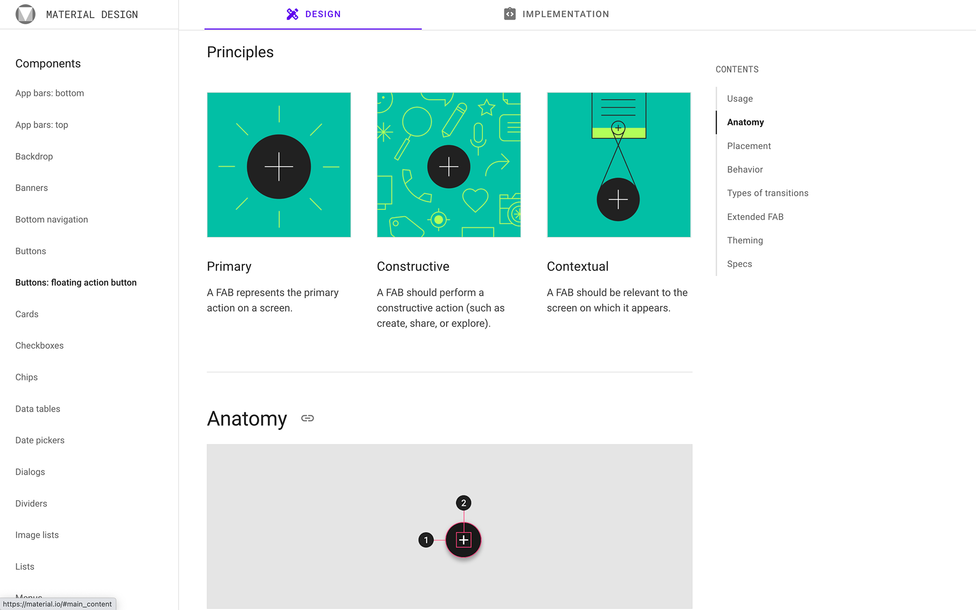
Material.io Utilized visual and written documentation for different types of content within the design system.
navigation & Content strategy
Based on my research of existing design systems, I quickly prototyped and tested different UI and navigation structures.
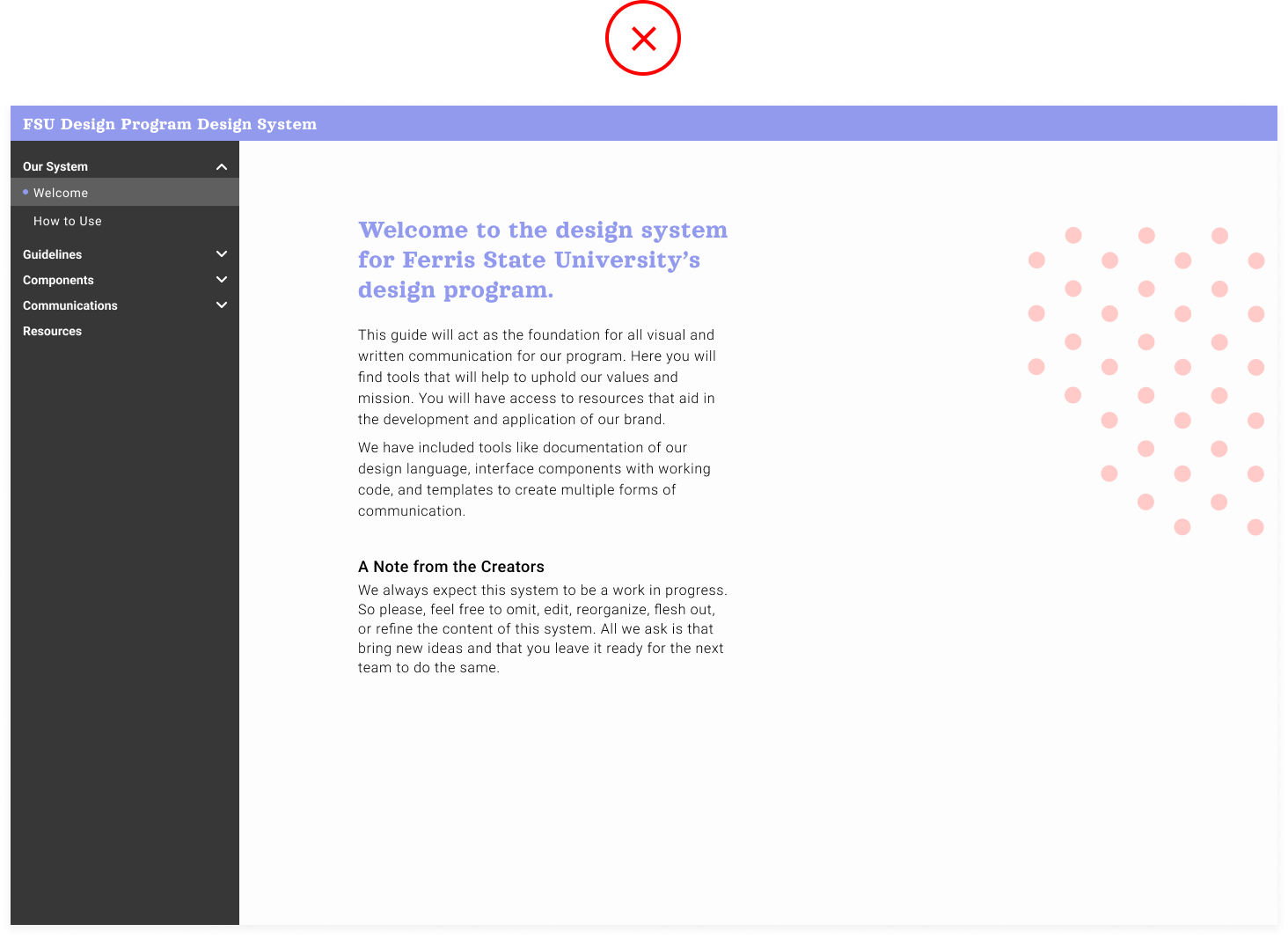
Vertical Navigation There was too much text which prevented students from quickly understanding what kind of information they can utilize in this system. Collapsing and scrolling to navigate the design system fragmented information.
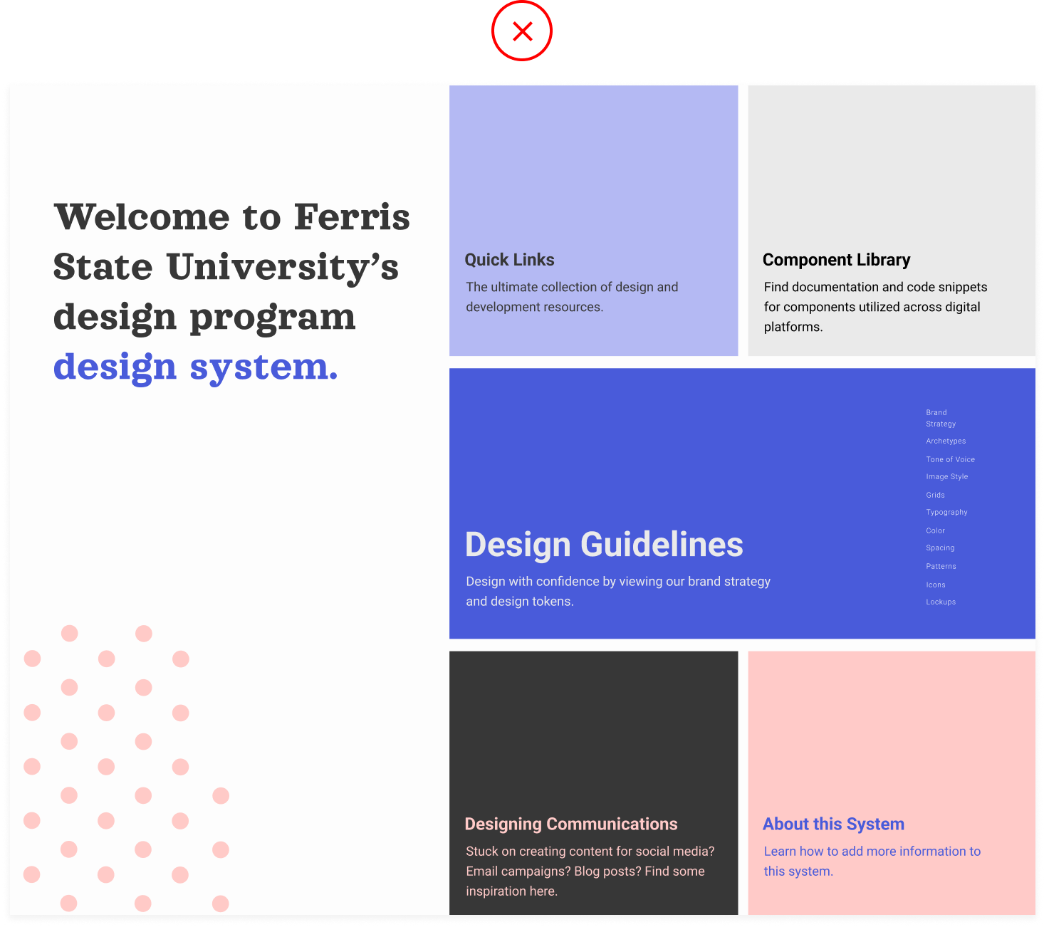
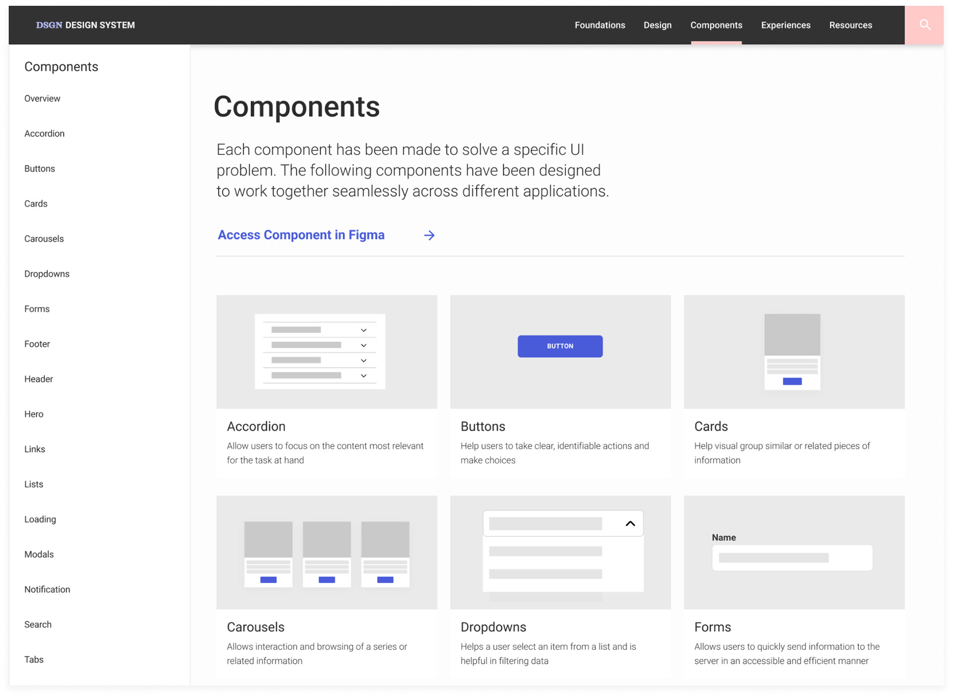
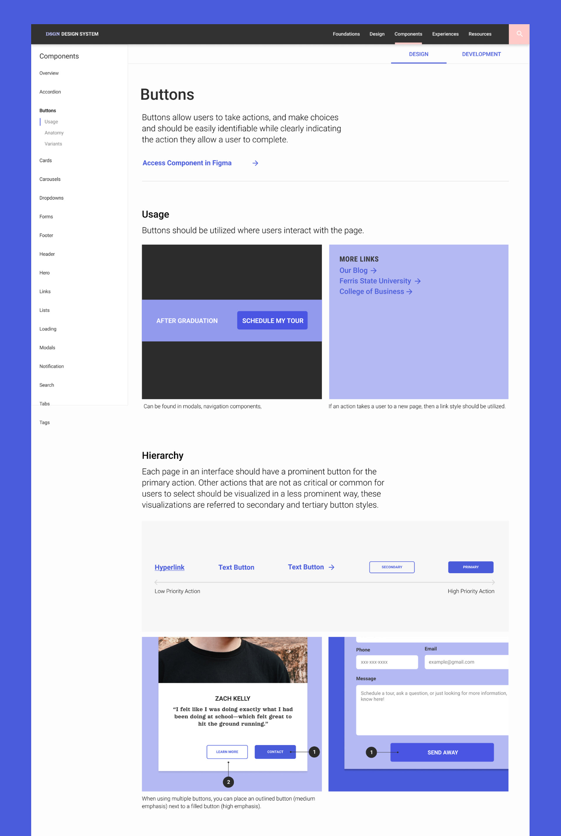
Overview Page While testing, a user said “It is not clear to me how I would quickly find something like a toast notification component from here.” This a where I realized there needs to be a balance of showing both large content categories and the context of the information within each category.
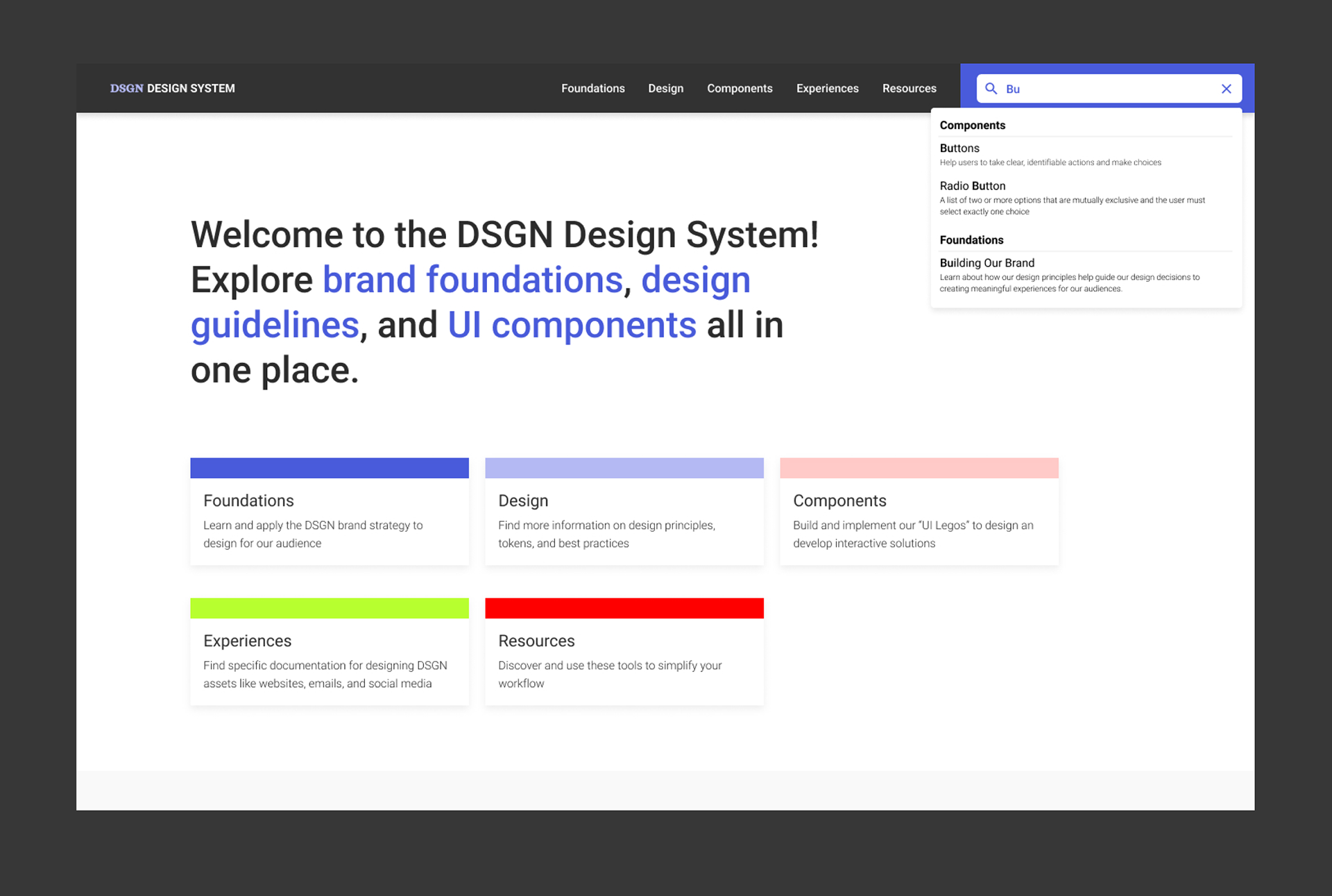
To help students navigate the design system, I included brief descriptions of the types of information within each category. I also included a search field for those who need to quickly access a specific component.
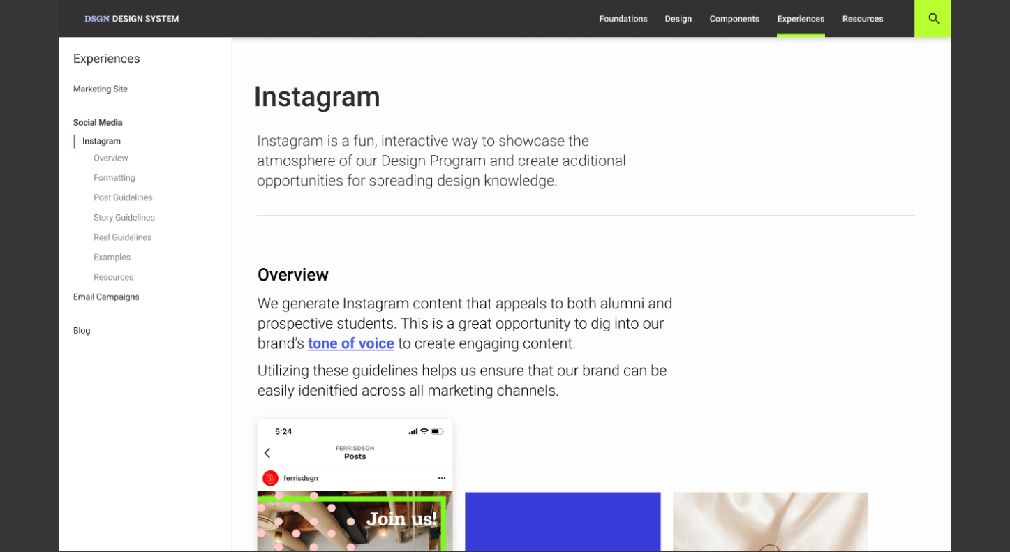
Vertical navigation and anchors are utilized on secondary pages to prevent excessive scrolling and provide an outline of the information organized within each component.
auditing existing design systems
To help students scan and quickly develop a shared awareness and vocabulary for common UI components, I included visuals and a brief description of their use on the component overview page.
Creating Documentation
To help students design with confidence, we needed to readjust our documentation strategy to provide guidelines that assist students in applying the tools in this system.
The Problem There wasn't enough context or information to show how to appropriately use the tools in this system so more inconsistencies don't occur in the future.
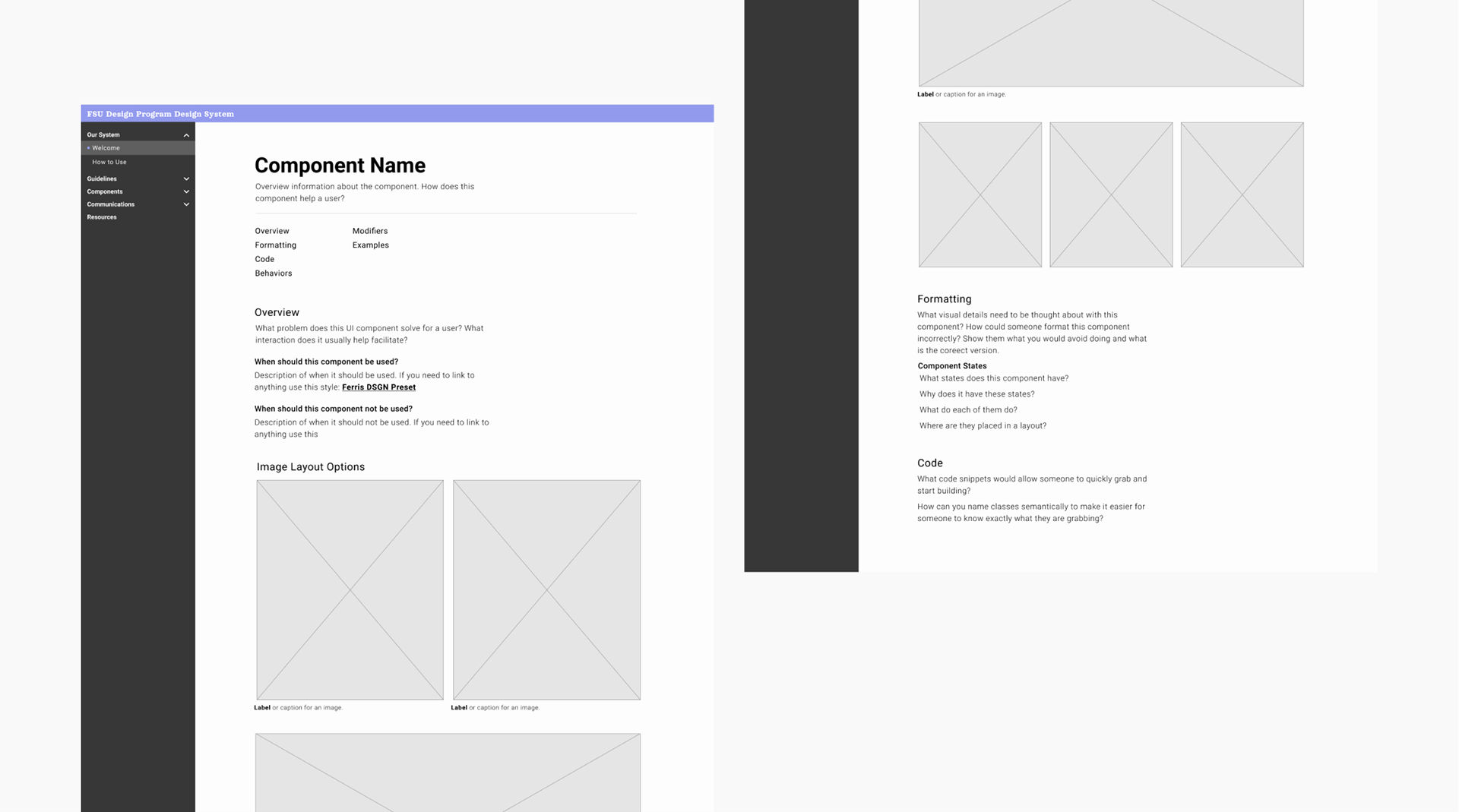
Providing Confidence Through Context I created a documentation wireframe for team members to utilize while documenting their section of the design system. Questions I crafted helped them write their content with future contributors in mind. Allowing team members to provide answers to these questions, such as “What problem is this component solving?” “What are the use cases?” or “How shouldn’t this component be used?” encouraged thoughtfulness and quality from those who build upon this system.
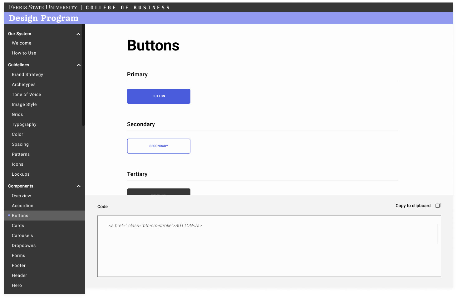
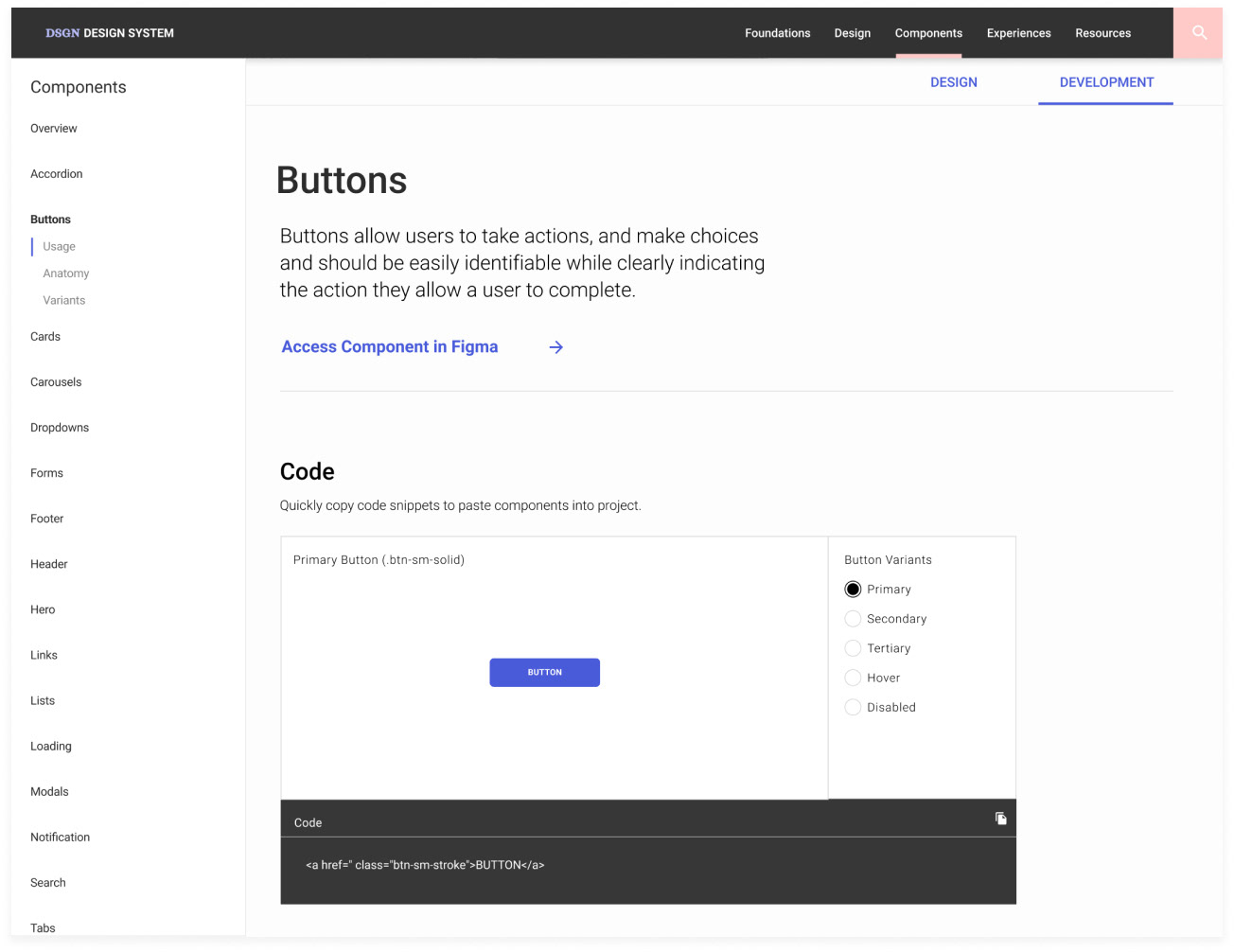
Development tools
I separated design and development information utilizing tabs so students wouldn’t have to sift through design and application documentation to find code snippets
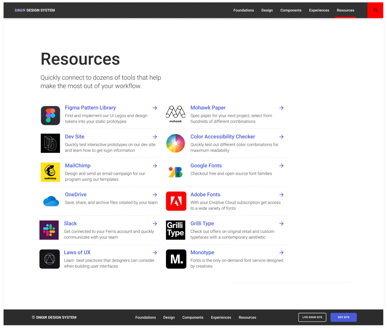
RESOURCES
To resolve questions students have for setting up and accessing tools we use in the program, we created a resource page.